


# The Ultimate Guide to Sports Graphing: 5 Steps to Transform Raw Data into Winning Insights
Sports graphing is the secret weapon of modern analysts, coaches, and serious fans. It is the process of visualizing complex athletic data through charts, plots, and diagrams to reveal patterns, trends, and insights that raw numbers alone cannot show. This guide will serve as your comprehensive playbook, moving from basic concepts to advanced applications. We will explore why this technique is revolutionizing sports, provide a hands-on tutorial, and equip you with the tools to start your own analysis.
At its core, sports data visualization is about communication. A well-designed graph can instantly convey a player’s shooting efficiency, a team’s defensive pressure zones, or the pacing of an entire match. While spreadsheets are useful, the human brain processes visual information 60,000 times faster than text. This is the power you unlock with effective graphing.
## What is Sports Graphing and Why Does It Matter?
Sports graphing is not just making pretty pictures. It is a critical analytical discipline that bridges the gap between data collection and actionable intelligence. In an era where every movement is tracked, the ability to synthesize this information determines competitive advantage.
The primary goals are clear: to evaluate performance, inform strategy, prevent injuries, and scout opponents. For instance, a basketball team might use shot charts—a fundamental form of sports plotting—to see if a player is taking inefficient long-two-point shots. A soccer analyst could graph a team’s pass network to identify the key playmaker and structural weaknesses. The application is universal across sports analytics.
## Key Types of Sports Graphs and Charts
Understanding which visual tool to use is half the battle. Different questions require different graphs. Here is a breakdown of the most essential types used in performance graphing.
SHOT CHARTS: The staple of basketball and hockey. They display the location and outcome of every shot attempt on a scaled court or rink. Heat maps are often overlaid to show concentration areas.
LINE GRAPHS: Perfect for tracking metrics over time. Use them to plot a player’s points per game across a season, a pitcher’s velocity throughout a game, or a team’s possession percentage over multiple matches.
BAR CHARTS AND HISTOGRAMS: Ideal for comparisons. Compare player statistics like rebounds or tackles, or show the distribution of sprint distances in a soccer match.
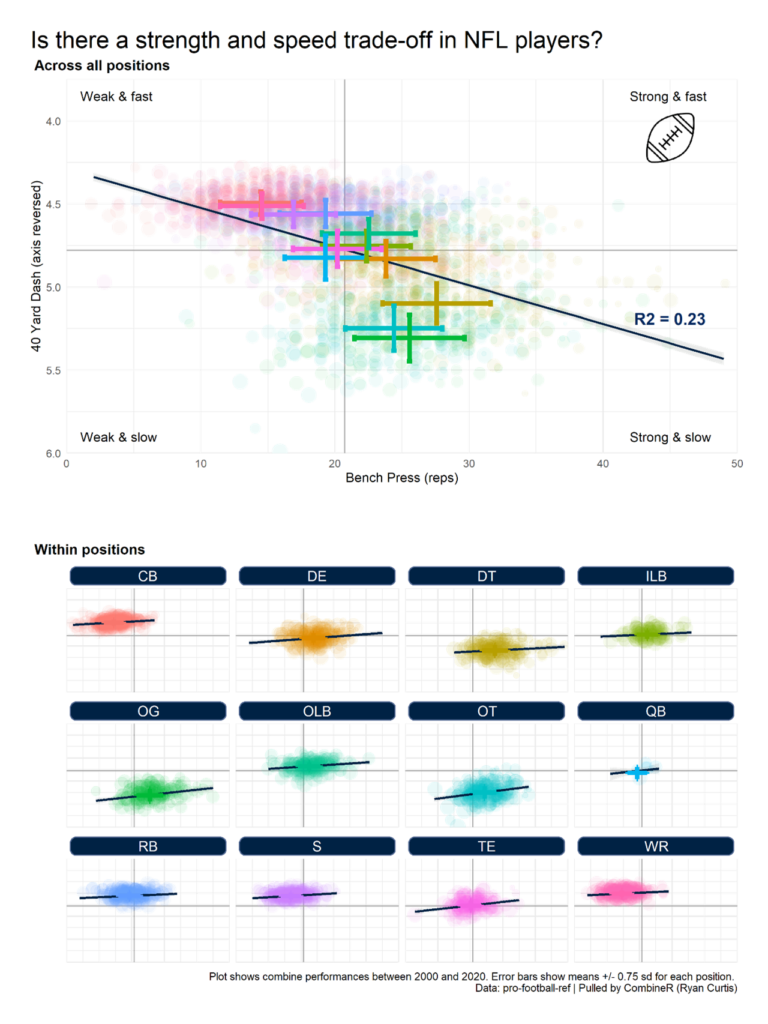
SCATTER PLOTS: Used to identify relationships between two variables. For example, plotting a quarterback’s pass attempts against completion percentage can reveal consistency.
TRACKING MAPS: Advanced visualizations that use positional data to show player movement, speed, and formation shape throughout a game. These are central to tactical analysis in sports like soccer and football.
## Essential Tools and Software for Sports Graphing
You do not need a PhD in data science to begin. A range of tools exists, from beginner-friendly to professional-grade. Your choice depends on your budget, technical skill, and depth of analysis required.
Here is a comparison of two popular approaches:
| Tool / Platform | Best For | Key Features | Learning Curve |
|---|---|---|---|
| Spreadsheet Software (e.g., Google Sheets, Excel) | Beginners, Basic Charts, Quick Analysis | Built-in chart types, easy data entry, widespread accessibility. Can create basic shot charts with templates. | Low to Moderate |
| Specialized Sports Software (e.g., Tableau, SportsCode, Python with Matplotlib/Seaborn) | Professionals, Custom Visualizations, Large Datasets | Dynamic dashboards, interactive elements, direct database connectivity, advanced statistical graphing. | Moderate to High |
For those starting out, mastering the graphing functions in a spreadsheet is a powerful first step. Many professional teams, however, rely on dedicated sports performance software that integrates video with data visualization for a complete picture.
## Your 5-Step Framework to Create a Powerful Sports Graph
Let us move from theory to practice. Follow this actionable framework to create your first impactful data visualization for sports.
STEP 1: DEFINE YOUR OBJECTIVE.
Ask a specific question. “Is my shooting effective?” is too vague. “What is my field goal percentage from the left corner of the three-point line versus the right corner?” is a question a graph can answer.
STEP 2: COLLECT AND CLEAN YOUR DATA.
Gather the relevant numbers. This could be manual entry from game logs or exporting data from a tracking service. CRITICALLY, check for errors. Missing or incorrect data points will render your analysis useless.
STEP 3: CHOOSE THE RIGHT GRAPH TYPE.
Match your question from Step 1 to the chart types discussed earlier. Comparing totals? Use a bar chart. Showing a trend over time? A line graph is your friend. Displaying spatial data? A shot chart or heat map is necessary.
STEP 4: BUILD AND REFINE THE VISUALIZATION.
Create the graph in your chosen tool. Then, refine it for clarity. Label your axes. Use a clear title. Choose a color palette that is colorblind-friendly. The goal is to make the insight obvious at a glance.
STEP 5: INTERPRET AND COMMUNICATE THE INSIGHT.
This is the most important step. What story does the graph tell? “This graph shows that 70% of our conceded goals come from crosses into the six-yard box, suggesting we need to strengthen aerial defense in that zone.” Connect the visual directly to a tactical or training implication.
## Common Pitfalls and How to Avoid Them
Even with the best tools, it is easy to make mistakes that mislead rather than inform. Here are major warnings.
WARNING: MISLEADING AXIS SCALES.
Starting the Y-axis at a number other than zero can dramatically exaggerate small differences. Always check your axis scales to ensure an honest representation.
WARNING: OVER-COMPLICATING THE GRAPH.
Adding too many data series, colors, or effects creates “chart junk.” It confuses the viewer. Adhere to the principle of simplicity: one clear idea per graph.
WARNING: IGNORING CONTEXT.
A graph showing a striker’s declining goals is meaningless without context. Is he injured? Facing tougher opponents? Has his role changed? Always pair your visualization with qualitative context.
WARNING: CONFUSING CORRELATION WITH CAUSATION.
A scatter plot might show that higher ticket sales correlate with more sunny game days. That does not mean sunshine causes ticket sales; a third factor (like pleasant weather) might influence both. Be humble in your conclusions.
## Real-World Applications and Case Studies
The proof is in the performance. Sports graphing is not theoretical. A famous example comes from the 2012 London Olympics, where the British cycling team used granular data visualization to optimize every aspect of performance, contributing to their dominance. They graphed everything from aerodynamic drag to athlete recovery metrics.
In the NBA, the widespread adoption of shot chart data has fundamentally changed offensive strategy, leading to the “three-point revolution.” Teams could visually prove the higher expected value of a three-point shot versus a long two-pointer. According to a study by the MIT Sloan Sports Analytics Conference, the analytical shift towards spatial efficiency, driven by graphing, has been a primary factor in the league’s strategic evolution over the last decade.
In my experience working with amateur sports teams, the moment a coach sees a player’s workload graph peaking dangerously high is the moment they understand the value of this tool. It moves the conversation from “he seems tired” to “his acute-to-chronic workload ratio has exceeded 1.5, significantly increasing injury risk.” That is a powerful shift.
## The Future of Data Visualization in Sports
The frontier is moving towards real-time graphing and immersive experiences. Imagine coaches receiving live defensive formation heat maps on a tablet during a game, or fans exploring interactive player movement graphs through augmented reality. Artificial intelligence will also play a role, automatically generating narrative insights from complex visualizations, suggesting the key story the graph is telling.
The integration of biometric data—heart rate, muscle load, neural fatigue—into standard sports plots will create a holistic view of the athlete. The graph of the future will not just show where a player ran, but how physiologically demanding each run was.
## Your Sports Graphing Action Checklist
To begin your journey into effective sports data visualization, use this practical checklist. Ensure you have covered each point before finalizing any analysis.
DEFINE A SINGLE, CLEAR ANALYTICAL QUESTION.
SELECT THE APPROPRIATE DATA SET AND VERIFY ITS ACCURACY.
CHOOSE THE GRAPH TYPE THAT BEST ANSWERS YOUR QUESTION.
DESIGN THE VISUALIZATION FOR MAXIMUM CLARITY AND HONESTY.
WRITE A ONE-SENTENCE SUMMARY OF THE CORE INSIGHT.
CONNECT THAT INSIGHT TO A CONCRETE ACTION OR DECISION.
SHARE THE GRAPH WITH ITS CONTEXTUAL EXPLANATION.
By mastering sports graphing, you gain the ability to see the game within the game. You move from intuition to evidence, from guesswork to strategy. Start with a simple question, follow the steps, and let the data tell its story.


