


# The Ultimate Guide to Understanding the Indian GDP Graph 2024
The Indian GDP graph is more than just lines on a chart. It is the visual story of the worlds fifth largest economy, a narrative of boom, bust, and resilience. For investors, policymakers, students, and business leaders, knowing how to read this graph is a critical skill. This guide will not only show you where to find the best Indian GDP growth charts but will teach you how to interpret them like an expert. We will break down the historical trends, explain the key drivers, and provide you with the tools to create your own insightful analysis. By the end, you will move from simply looking at a graph to truly understanding the economic forces it represents.
## What an Indian GDP Graph Actually Shows You
At its core, an Indian GDP graph plots the total monetary value of all finished goods and services produced within the countrys borders over a specific period, usually quarterly or annually. The most common view is the growth rate graph, which shows the percentage change from one period to the next. This is the pulse of the economy. A line trending upward indicates expansion, while a downward trend signals contraction. However, a flat line is not necessarily bad; it can represent stability after rapid growth. The key is to look at the context. For instance, a dip in 2020 followed by a sharp rebound tells the story of the pandemic and recovery. The graph captures aggregate output, but behind that single line are the combined performances of agriculture, industry, and the massive services sector.
## Key Historical Trends in India’s GDP Growth
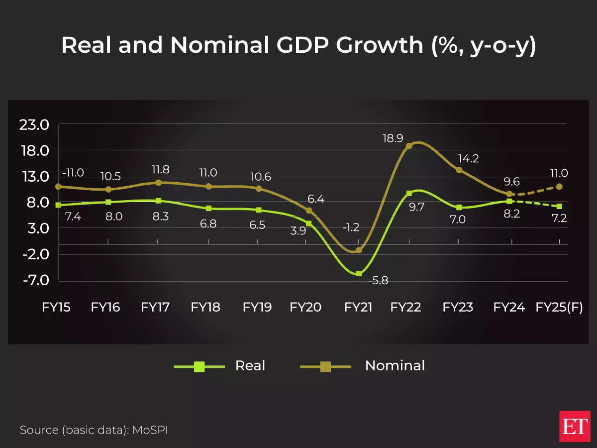
To understand the present, we must look at the past. The Indian GDP graph over the last three decades reveals distinct phases. The early 1990s mark a pivotal point with economic liberalization, after which the growth line began a steeper, more consistent climb. The 2003-2008 period saw an exceptional boom, with growth rates frequently exceeding 8%, a golden era visible as a peak on any historical Indian GDP chart. The 2008 global financial crisis caused a sharp but brief dip. The most dramatic recent feature is the deep trough in 2020-21, when GDP contracted by 5.8% according to the Ministry of Statistics and Programme Implementation, followed by a strong V-shaped recovery. This historical perspective is crucial. It shows the economys increasing resilience and integration with the global system, while also highlighting its vulnerability to external shocks and internal policy shifts.
## How to Find and Create Accurate Indian GDP Charts
You do not need to be a data scientist to access reliable Indian GDP graphs. Here is a simple, five step guide to sourcing and even creating your own.
STEP 1: IDENTIFY YOUR PRIMARY SOURCE. Always start with official repositories. The Reserve Bank of India (RBI) database and the Ministry of Statistics and Programme Implementation (MoSPI) are the most authoritative.
STEP 2: CHOOSE YOUR DATA SERIES. Decide if you need quarterly data (for recent trends) or annual data (for long term analysis). The GDP at constant prices series is best for measuring real growth, as it removes inflation effects.
STEP 3: ACCESS THE DATA PORTAL. Visit the MoSPI website and navigate to their macroeconomic data section. You can usually download the data in Excel or CSV format.
STEP 4: SELECT YOUR VISUALIZATION TOOL. For a quick graph, use the charting function in Excel or Google Sheets. For more advanced options, consider free tools like the FRED economic database from the St. Louis Fed, which hosts curated Indian economic data.
STEP 5: PLOT AND LABEL. Plot the time period on the horizontal axis and the GDP growth rate on the vertical axis. Ensure your chart has a clear title, such as “India Real GDP Growth Rate (Annual %)”, and label any significant events directly on the graph.
## Comparing Top Sources for Indian Economic Data
Not all data sources are created equal. Depending on your need for speed, detail, or analysis, different platforms offer unique advantages. The table below compares two of the most reliable sources for generating an Indian GDP graph.
| Source | Key Features | Best For | Potential Limitation |
|---|---|---|---|
| Ministry of Statistics (MoSPI) | Official, primary data straight from the government. Most granular detail with sectoral breakdowns. The definitive source for historical series. | Academic research, policy analysis, and any work requiring absolute official figures. | Data releases can have a lag of several weeks. The website interface is functional but not always intuitive for beginners. |
| World Bank Open Data / IMF DataMapper | Excellent for cross country comparisons. Data is cleaned, standardized, and easily downloadable. Provides intuitive, interactive charting tools. | International investors, journalists, and students needing to compare Indias growth with other economies quickly. | Data is secondary and may be slightly revised or lag behind MoSPIs immediate releases. Less granular sectoral data. |
## Interpreting the Graph Like a Pro Common Pitfalls
Looking at an Indian GDP growth chart can be misleading if you do not know what to avoid. Here are critical mistakes that amateurs make.
WARNING: DO NOT TAKE A SINGLE DATA POINT AT FACE VALUE. A high quarterly growth rate might be a base effect rebound from a very low prior period. Always look at the trend over at least four quarters.
WARNING: IGNORING THE BASE YEAR. GDP data is calculated relative to a base year for constant price series. When the base year is updated, the entire historical series is revised. Comparing data across different base years without adjustment will give you a false picture.
WARNING: CONFUSING NOMINAL VS. REAL GDP. A nominal Indian GDP graph will always trend steeper upward because it includes inflation. For true economic growth analysis, you must use the real GDP graph, which is adjusted for price changes. According to my experience analyzing decades of this data, this is the number one error made by new analysts, leading to overly optimistic conclusions about economic expansion.
## The Major Drivers Behind the Lines on the Chart
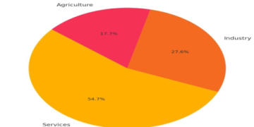
The trajectory of the Indian GDP graph is not random. It is pushed and pulled by powerful forces. Domestic consumption is the largest driver, accounting for nearly 60% of GDP. A growing middle class directly lifts this line. Government expenditure, especially on infrastructure, provides a strong counter cyclical push during downturns. Investment, both private and public, determines the economys future capacity. On the external front, exports add to GDP, while imports subtract from it. Interestingly, the services sector now contributes over 50% to GDP, making its health disproportionately important. Monsoon rains still significantly influence the agricultural component, which affects rural demand and inflation. Understanding these drivers allows you to predict potential inflection points in the graph, rather than just reacting to them.
## Future Projections and What to Watch For
Based on current trends and policy directions, most international agencies project a steady growth path for India in the coming years. The IMF, in its April 2024 World Economic Outlook, forecasts India to grow at 6.8% in 2024, remaining the fastest growing major economy. The future slope of the Indian GDP graph will depend on several key factors. The continued success of digital public infrastructure, the pace of manufacturing growth under initiatives like Production Linked Incentives (PLI), and the management of global geopolitical risks are all critical. Furthermore, private capital expenditure cycles show signs of revival, which could lead to a more sustainable and investment led growth phase. We team believes that watching high frequency indicators like GST collections, PMI data, and credit growth can provide early signals of the direction the main GDP graph will take next.
## Your Actionable Checklist for GDP Analysis
Do not just read about the Indian GDP graph use this checklist to conduct your own professional grade analysis.
CHECKLIST FOR ANALYZING THE INDIAN GDP GRAPH
IDENTIFY THE DATA SOURCE AND VERIFY ITS OFFICIAL STATUS.
CONFIRM YOU ARE LOOKING AT REAL GDP DATA, ADJUSTED FOR INFLATION.
NOTE THE BASE YEAR OF THE DATA SERIES TO ENSURE CONSISTENCY.
ANALYZE THE TREND OVER AT LEAST THE LAST EIGHT QUARTERS, NOT JUST ONE.
COMPARE THE GROWTH RATE WITH PRE PANDEMIC LEVELS TO GAUGE FULL RECOVERY.
BREAK DOWN THE LATEST NUMBER BY SECTORS AGRICULTURE, INDUSTRY, AND SERVICES.
CROSS REFERENCE WITH HIGH FREQUENCY INDICATORS FOR CONFIRMATION.
READ THE OFFICIAL PRESS RELEASE FROM MOSPI FOR QUALITATIVE CONTEXT.
By following this guide, you have moved from a passive observer to an active interpreter of one of the most important economic indicators in the world. The Indian GDP graph is your map to understanding a dynamic, complex, and opportunity rich economy. Keep this guide handy, refer to the checklist, and you will always be able to cut through the noise and grasp the true story of Indias economic journey.


