


# The Ultimate Guide to Luxury Clothing Brand Logos: Decoding Status, History, and Design Secrets
A logo is more than a graphic. For a luxury fashion house, it is a condensed universe of meaning, a silent ambassador of status, and a multi-billion dollar asset. The world of luxury clothing brand logos is a fascinating study in psychology, history, and meticulous design. This guide will decode the secrets behind these iconic symbols, exploring their evolution, the psychology that makes them so powerful, and what the future holds for luxury branding.
## The Psychology of a Luxury Logo: Why Simplicity Speaks Volumes
Why do a simple double-C, an interlocking G, or a sleek italic font command such reverence? The psychology is deliberate. Luxury logos operate on principles of exclusivity and recognition. They are often minimalist, leveraging negative space and clean typography. This simplicity signals confidence. The brand does not need loud graphics to be seen; its status is assumed.
This minimalism also creates a timeless quality. While fast-fashion logos shout for attention, luxury emblems whisper. They are designed to endure trends, becoming classic markers of heritage. Furthermore, these logos act as a tribal identifier. Displaying a recognizable luxury emblem on a handbag or shirt collar signals membership to an aspirational group, communicating taste and economic power without a word. According to a study published in the Journal of Consumer Research, consumers often use branded products to construct and communicate their self-identity, with luxury goods playing a pivotal role in signaling social status (来源: Journal of Consumer Research).
## A Historical Journey: Evolution of Iconic Fashion Logos
Many of today’s most iconic symbols have humble or radically different beginnings. Examining their evolution reveals how brands adapt while preserving core identity.
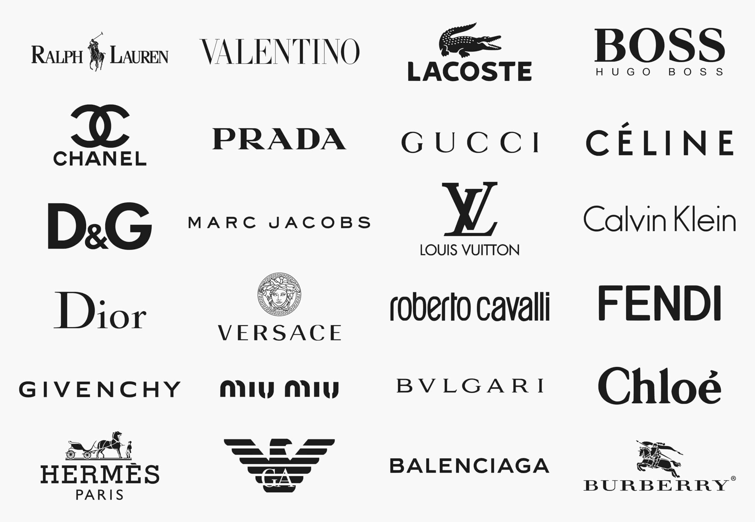
Take the Chanel logo. The interlocking double-C, now synonymous with Coco Chanel, was registered in 1925. Its symmetry and simplicity reflected the modernist principles she loved. It has remained virtually unchanged for a century, a testament to perfect initial design. Conversely, the Burberry logo has undergone significant shifts. From an elaborate knight on horseback to the now-dominant serif font and “Prorsum” horse emblem, it refined its identity to balance heritage with contemporary relevance.
The Gucci logo, with its double-G serif monogram, was created by Aldo Gucci in the 1960s, inspired by his father Guccio’s initials. It became a defining symbol of glamour. However, in the 1990s, over-exposure led to a decline. Under new creative direction, the logo was used more sparingly and thoughtfully, restoring its luxury cachet. This history shows that a logo’s power is not static; it must be managed with strategic care.
## Deconstructing the Elements: Typography, Color, and Symbolism
Every detail in a luxury fashion emblem is a conscious choice. Lets break down the core components.
TYPOGRAPHY is paramount. Many houses use custom serif fonts. Serifs—the small lines at the ends of strokes—convey tradition, craftsmanship, and authority. Think of the elegant serifs in Yves Saint Laurent or Dior logos. Sans-serif fonts, like the clean Helvetica used by early Helmut Lang, communicate modernity and avant-garde minimalism.
COLOR palettes are typically restrained. Black, white, and gold dominate. Black exudes sophistication and power. White suggests purity and simplicity. Gold directly communicates luxury, wealth, and premium quality. The consistent use of these colors reinforces the brand’s premium positioning.
SYMBOLISM is often drawn from heritage. The Lacoste crocodile was inspired by founder René Lacoste’s tennis nickname. The Ralph Lauren polo player instantly evokes a world of aristocratic sport and leisure. These symbols tell a story, connecting the product to a desirable lifestyle or a founder’s myth.
## The Modern Challenge: Logos in the Digital and Streetwear Era
The digital age and the rise of streetwear have dramatically reshaped luxury logo design and usage. Logos must now be legible on a tiny smartphone screen, leading to further simplification. More profoundly, streetwear’s “logo-mania” has influenced high fashion.
Brands like Louis Vuitton, with its iconic LV monogram, and Fendi, with its double-F pattern, have embraced bold, graphic logo prints as central design elements, not just discreet labels. This is a direct dialogue with contemporary culture where logos are worn as expressive, celebratory art. However, this presents a tightrope walk: how to be bold and visible while retaining an aura of exclusivity. The most successful brands, like Balenciaga with its distorted logos or Vetements with its ironic takes, play with the logo itself, commenting on its own power.
## How to Authentically Analyze and Appreciate a Luxury Logo
You can develop a more discerning eye by following this simple five-step framework.
STEP 1: IDENTIFY THE CORE COMPONENT. Is it a wordmark (like Cartier), a monogram (like Louis Vuitton), or a pictorial symbol (like the Burberry knight)?
STEP 2: ANALYZE THE TYPOGRAPHY. Is it serif or sans-serif? What mood does the font style convey? Is it custom or a modified existing font?
STEP 3: DECODE THE COLOR SCHEME. What are the primary colors? What psychological associations do they trigger? How does the color work on different backgrounds?
STEP 4: RESEARCH THE HISTORICAL CONTEXT. When was the logo introduced? What was the brand’s position then? Has it evolved? A quick search can reveal fascinating origin stories.
STEP 5: ASSESS ITS APPLICATION. Look at how the logo is used on products, in advertising, and online. Is it used prominently or subtly? Does its application feel consistent with the brand’s perceived status?
## Comparison: Monogram vs. Wordmark Luxury Logo Strategies
Different luxury brands adopt different logo strategies, primarily falling into two camps: the iconic monogram and the authoritative wordmark. The table below contrasts these two dominant approaches.
| Aspect | Monogram Logo (e.g., Gucci, Louis Vuitton, Chanel) | Wordmark Logo (e.g., Prada, Burberry, Hermès) |
|---|---|---|
| Core Design | Intertwined or adjacent initials of the founder or brand name. | Stylized text spelling out the full brand name. |
| Primary Strength | High recognizability as a graphic symbol; versatile for patterns. | Direct reinforcement of brand name; often perceived as more mature and understated. |
| Potential Weakness | Can become overexposed and lose exclusivity if not managed carefully. | May be less instantly graphic and require more space for clear legibility. |
| Brand Association | Often linked to heritage, founder legacy, and bold brand expression. | Frequently associated with modern sophistication, clarity, and confidence. |
| Example Application | Printed on canvas bags, embossed on leather goods, used as all-over prints. | Engraved on watch faces, stitched on garment labels, used in minimalist advertising. |
## Common Misconceptions and Pitfalls to Avoid
When evaluating luxury brand emblems, several misconceptions are common. First, many assume a more complex or ornate logo is inherently more luxurious. As we have seen, the opposite is often true. Simplicity and confidence are the hallmarks. Second, people often think these logos never change. In reality, they undergo subtle refinements—kerning adjustments, slight proportion tweaks—to stay visually sharp in new contexts. A 2021 report by Brand Finance noted that even the most stable luxury logos require careful “brand maintenance” to preserve their financial value, which can fluctuate based on consumer perception (来源: Brand Finance Apparel 50 Report).
Another major pitfall is conflating visibility with value. Just because a logo is heavily printed on a product does not automatically increase its luxury status. In fact, according to my experience working with brand strategists, the most coveted luxury items often feature the logo in its most subtle form—a small, discreet plaque or embossing. The product’s quality and design should command attention first, with the logo serving as a final seal of authenticity.
## The Future of Luxury Branding: Logos in a Post-Logo World
We are entering an intriguing era. As sustainability and minimalism grow, some consumers are moving towards “quiet luxury”—products with no visible logos at all. This “stealth wealth” trend pushes brands to communicate status through cut, fabric, and craftsmanship alone. Does this mean the end of the luxury logo? Not likely.
Instead, it signals a bifurcation. On one path, logos will become even more embedded as digital assets—in NFTs, virtual fashion, and augmented reality experiences. On the other path, physical logos may become more subtle, like secret codes for those in the know. The logo’s function will evolve from overt display to a flexible tool for community building and multi-platform identity. The successful luxury houses will be those that master both the bold symbol and the silent whisper.
## Your Practical Checklist for Understanding Luxury Logos
To solidify your knowledge, use this actionable checklist the next time you encounter a prestigious fashion brand emblem.
– Observe the logo’s primary form: wordmark, monogram, or symbol.
– Note the font characteristics and what feeling they immediately evoke.
– Identify the dominant color and its psychological implication.
– Research the logo’s origin story and any major historical revisions.
– Compare how the logo is applied across different products and campaigns.
– Consider the logo’s size and placement: is it loud or discreet?
– Reflect on what the logo communicates about the brand’s target customer.
– Assess its adaptability to digital and physical mediums.
– Question whether it feels timeless or tied to a specific trend.
– Decide if the logo successfully makes you desire the world it represents.
By moving beyond simple recognition to deep understanding, you unlock a new layer of appreciation for the art and science of luxury fashion branding. These logos are not just marks; they are the keystones of cultural empires.


