


# The Ultimate Guide to Luxury Brand Logos: Design, Meaning, and Power
A luxury brand logo is far more than a simple graphic. It is a condensed universe of meaning, a silent ambassador, and a multi-billion dollar asset. It whispers heritage, screams exclusivity, and communicates values without uttering a single word. In this deep dive, we explore the intricate world of high-end emblems, from their psychological foundations to their practical evolution. Understanding these symbols is key to grasping the very essence of luxury itself.
Q: WHAT MAKES A LOGO TRULY LUXURIOUS?
The answer lies not in opulent decoration, but in calculated restraint and profound meaning. Luxury logos operate on a different set of principles compared to mass-market symbols. They prioritize legacy over trend, subtlety over shout, and craftsmanship over convenience. A study on consumer perception found that over 70 percent of luxury purchases are driven by the emotional value and brand story, of which the logo is the primary visual shorthand (来源: Bain & Company Luxury Study). This emblem must instantly evoke a feeling of quality, history, and belonging to an exclusive club.
Let us examine the core pillars that define these prestigious marks.
HERITAGE AND STORYTELLING: THE BEDROCK OF PRESTIGE
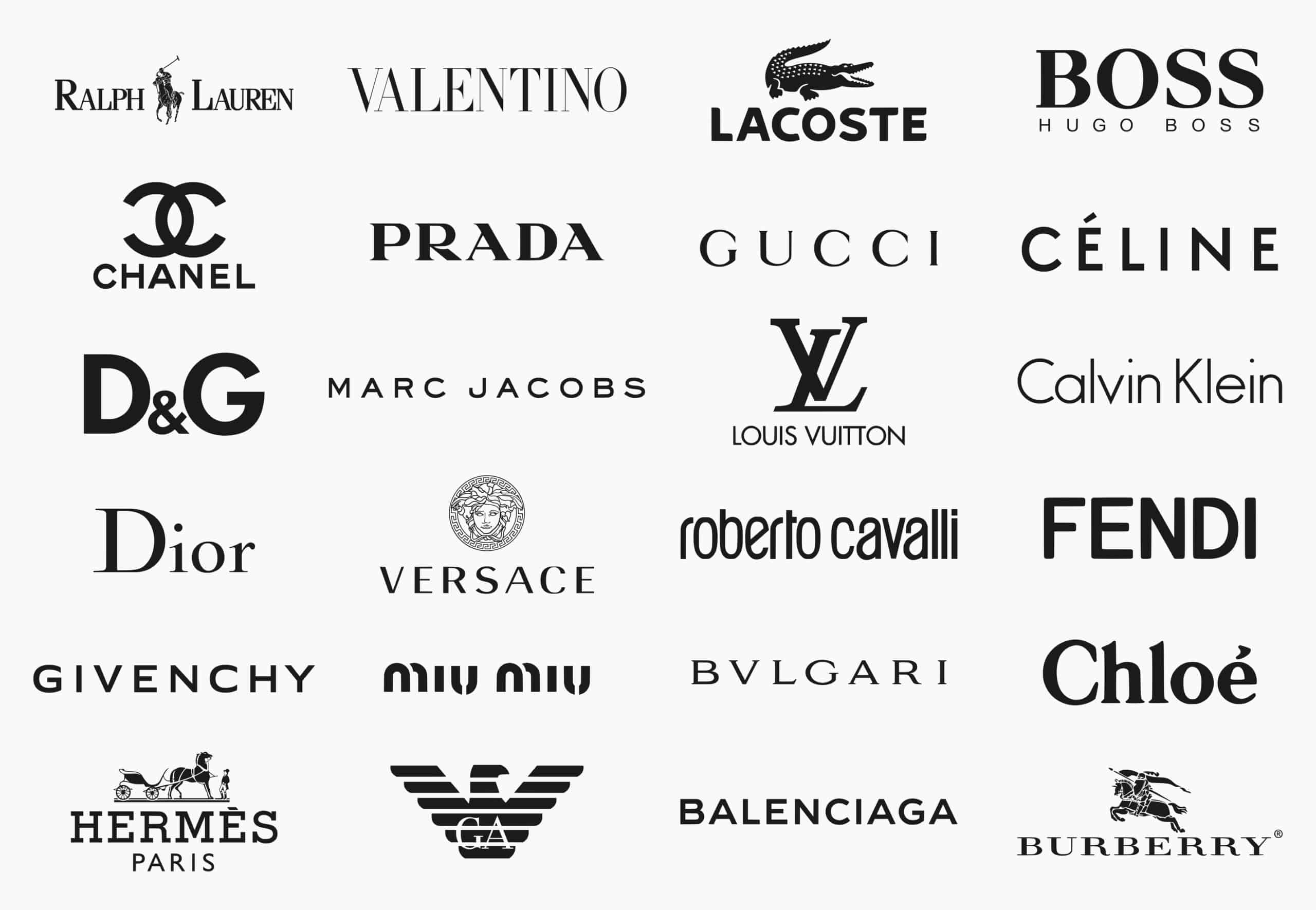
Most iconic luxury logos are steeped in history. They often originate from a founder’s signature, a family crest, or a symbol deeply personal to the brand’s origin story. The interlocking C’s of Chanel, for instance, are not just a pleasing monogram; they represent Coco Chanel herself, immortalizing her identity. The story becomes part of the product’s value. When you buy an item bearing that logo, you are buying a chapter of that history. This narrative is meticulously maintained and communicated, making the logo a seal of authentic heritage.
MINIMALISM AND TYPOGRAPHY: THE POWER OF LESS
Paradoxically, in the realm of luxury, less is almost always more. While some heritage houses use elaborate coats of arms, the modern trend and enduring strength lie in minimalist design. Think of the sleek, sans-serif font of SAINT LAURENT or the clean geometry of the Rolex crown. This simplicity signals confidence. The brand does not need loud graphics to be recognized; its reputation precedes it. The typography is always custom, meticulously crafted, and impossible to replicate perfectly without authorization. This attention to detail in the letterforms themselves is a hallmark of luxury.
SYMBOLISM AND HIDDEN MEANINGS: THE SECRET LANGUAGE
Many luxury insignias contain layers of hidden meaning. The Ralph Lauren polo player is not just a sportsman; it evokes an entire lifestyle of aristocratic leisure and equestrian tradition. The twin-horse carriage of Hermès directly references its origins as a harness workshop for the European nobility. These symbols act as a code for the initiated. Recognizing and understanding the symbolism deepens the connection between the brand and the consumer, fostering a sense of insider knowledge and sophistication.
EVOLUTION VS. PERMANENCE: WALKING THE TIGHTROPE
One of the greatest challenges for a luxury maison is managing the evolution of its visual identity. Change too much, and you risk diluting a century of brand equity. Change too little, and you risk appearing stagnant. The most successful updates are subtle refinements, not revolutions. For example, Burberry’s recent shift to a simpler, sans-serif font and a cleaner equestrian knight logo removed the dated serifs while preserving the iconic figure. This process is a high-stakes balancing act.
To illustrate the distinct approaches within the luxury sphere, consider the following comparison of two iconic strategies.
| Brand & Logo | Core Design Philosophy | Primary Symbolism | Evolution Strategy |
|---|---|---|---|
| LOUIS VUITTON (LV Monogram & Quatrefoil) | Ornamental, Pattern-Centric. Designed to combat counterfeiting in the late 19th century, it is meant to be decorative and instantly recognizable as a surface pattern. | Status, Travel, Heritage. The monogram represents the founder, while the floral motifs symbolize legacy and craftsmanship. | Extremely cautious. The core monogram is sacrosanct. Innovation happens through collaborations with artists (e.g., Takashi Murakami, Yayoi Kusama) who reinterpret the canvas, not the logo itself. |
| CELINE (Minimalist Typography) | Ultra-Minimalist, Typographic. The brand under recent creative direction has stripped back to pure, clean, sans-serif capital letters. | Modernity, Quiet Luxury, Parisian Chic. The logo communicates sophistication through absence of ornament, appealing to a contemporary, discerning customer. | Radical simplification. The brand made a decisive break from its previous, more ornate script logo to embrace a stark, modern aesthetic that defines its current identity. |
HOW TO DECODE A LUXURY BRAND LOGO: A STEP-BY-STEP GUIDE
You can train your eye to appreciate and analyze any high-end emblem. Follow this five-step process the next time you encounter a prestigious logo.
STEP 1: OBSERVE THE FORM. Is it a monogram, a pictorial symbol, or purely typographic? Note the shapes, lines, and negative space.
STEP 2: RESEARCH THE ORIGIN. Look up the brand’s founding story. What does the symbol literally represent? A person, an animal, an object from the founder’s life?
STEP 3: ANALYZE THE TYPOGRAPHY. If letters are present, are they serif or sans-serif? Script or block? Custom-drawn or a known font? This speaks volumes about the brand’s personality.
STEP 4: DECIPHER THE COLOR. Classic luxury often uses black, white, gold, or deep tones. What psychology is the color conveying? Authority (black), purity (white), or wealth (gold)?
STEP 5: CONSIDER THE CONTEXT. Where and how is the logo applied? Is it prominently displayed or subtly embossed? This indicates the brand’s confidence level and target audience.
COMMON MISCONCEPTIONS ABOUT LUXURY LOGOS
A widespread mistake is equating complexity with luxury. As we have seen, some of the most powerful logos are strikingly simple. Another error is believing these logos are designed purely for aesthetic appeal. In reality, every curve, spacing, and proportion is calculated for maximum recognition, reproduction quality (on leather, metal, fabric), and legal distinctiveness. Furthermore, a logo alone does not make a brand luxurious. It is the consistent delivery of exceptional quality, service, and experience over decades that imbues the symbol with its power. The logo is the promise; the product is the fulfillment.
From my experience consulting with premium brands, the most common pitfall we see is a desire to chase short-term design trends. A luxury logo must feel timeless. We always advise clients to think in terms of decades, not seasons. A logo that looks ‘of the moment’ today will look dated in five years, eroding the perception of permanence that luxury relies upon.
THE FUTURE: DIGITAL ADAPTATION AND NEW FRONTIERS
The digital age presents new challenges. Logos must now be legible on tiny smartwatch screens and dynamic in digital animations. Some brands are creating simplified versions or animated logos for digital use. Furthermore, the rise of the metaverse and NFTs is pushing luxury houses to rethink their visual assets for virtual worlds. How does a logo denoting physical craftsmanship translate to a purely digital asset? The brands that successfully adapt their iconic symbols to these new realms will secure their relevance for the next century.
In conclusion, a luxury brand logo is a masterpiece of strategic design. It is a vessel for history, a marker of quality, and a psychological trigger. It balances the weight of tradition with the need for modernity. By understanding the principles behind these powerful symbols, we gain insight into the very mechanics of desire and value in the high-end market.
YOUR LUXURY LOGO ANALYSIS CHECKLIST
– Identify the core design format: monogram, symbol, or wordmark.
– Research the historical origin and founder’s story.
– Examine the typography for custom details and font style.
– Note the color palette and its psychological associations.
– Assess the logo’s application: prominent, subtle, or patterned.
– Consider its evolution timeline and key changes.
– Evaluate its adaptability across physical and digital media.
– Decode the implied lifestyle or values the symbol represents.
– Compare it to competitors within the same luxury segment.
– Reflect on your own emotional response to the design.

